Author: DivyaJyoti (DJ) Rajdev
Contributors: Michael O'Connell, Marion Azoulai
Overview

Personal computers in 80's spawned an era of computer literacy, similarly today ever increasing volumes of data is moving the workforce towards towards adopting Data Literacy. Literacy is formally defined as competence or knowledge in a specified area. In the age of Data, literacy has expanded to include data. Data literacy is the desire and ability to constructively engage in society and business through and about data.
Types of Data Literacy
The broad field of data literacy breaks down into 3 fields:
-
Data Literacy
Ability to read, understand, create and communicate data as information.
-
Statistical Literacy
Ability to understand and reason with statistics and data. It is often taken to also include taken to include having the abilities to both critically evaluate statistical material and appreciate the relevance of statistically-based approaches to all aspects of life in general or to the evaluating, design, and/or production of scientific work.
-
Visual Literacy
Ability to interpret, negotiate, and make meaning from information presented in the form of an image or visualization.
Understanding the Terms
Like every area of knowledge work, data literacy has its own terminology as well. We discuss briefly some concepts related to different types or branches of DL. These terms are essential to understand any data-driven solution.
Data and Metadata Descriptions
- Metadata: description and context of data
- Records: Rows in a database or dataset
- Observation: a single row containing one or more columns from the data
- Attributes: Columns in a database or dataset
- Data Dictionary: A set of information describing the each column, the content, format, and structure of data and some information about relationships or patterns in data
- Sample: A subset of data. Under-sampling omits some records whereas over-sampling overcounts some records
-
Sample Size: The number of observations being considered
Data or Variable Types

- Continuous: often referred to as "numeric"; measurements to some level of accuracy
- Categorical or Nominal: categories / buckets
- Cardinality: number of levels or distinct values in a categorical variable. Cardinality can explode when creating variables to represent text
- Ordinal: categorical with ordered categories e.g. low, medium, high
- Binary: categorical with 2 categories e.g. True/False, 0/1; also referred to as Boolean, Bernoulli, Dirac Delta
- Text: often referred to as "strings" or unstructured data
- Time Series: measurements in time to some level of accuracy, often arranged in hierarchy e.g. minute, hour, day week, month, year
- GeoSpatial: spatial coordinates e.g. lat/long, areas such as states, counties, shop floor, airport; often arranged in hierarchy e.g. country, state, city
- Graph data: Unstructured, hierarchical, or network data.
Statistical Analysis

Fig. shows model building process at a glance
- Model: is a simplified, mathematical way or algorithm to approximate reality or your business problem and optionally to make predictions from this approximation.
- Model training: providing the model known data to learn from
- Model testing: using the trained model to predict outcome for known data. This will be used to judge the goodness of model.
- Parameters: internal property of a model; typically estimated from data
- Model fit: Measuring how well the model approximates reality or how good the predictions are. ROC, AIC, BIC, Accuracy, Precision, Recall, RMSE, residual fit etc. are all different criteria or curves to judge model fits.
- Statistical Significance: A test of whether the observed outcome or predicted outcome could happen due to chance. If not, the result or outcome is said to be statistically significant.
- Target Variable: In a model it is the outcome being predicted also referred to as Response Variable or y variable by statisticians.
- Explanatory Variables: Attributes or variables that explain variation or patterns in Target, often referred to as x variables or "X" a matrix of variables.
- Variable importance or influence: A rank order of explanatory variables that based on their relative influence on the target variable.
- Multivariate: Using more than one variable
- Features: Typically transformations of Attributes into variables that better explain variability in Target. Consider a date variable, but itself it might not explain user shopping behavior. But when transformed to the feature binary variable Weekday/Weekend, it can explain some patterns in target.
- Featurization or feature engineering: the methodology to transform raw data to features
- One hot encoding: Featurization technique that creates multiple columns to represent a categorical variable, often labeling the current level "1" and "0"'s for all other levels
- Binned variable: Creating discrete distinct bins or buckets from continuous data.

Example: Scoville scale is a continuous measure for how spicy a chilli is. But for someone trying to order wings it is more informative to have bins mild/medium/hot rather than Scoville units.
Learn basic statistics visually with interactive examples from Brown University
Learn basic and advanced statistics with videos from Prof. Josh Starmer
Types of Models

- Supervised Learning: model training with a known target variable and learning patterns that have been recorded in data; often requires labeling to construct the target.
- Unsupervised Learning: model training with no known target variable and learning patterns that haven't been seen before e.g. outliers and anomalies
- Optimization: Maximizing or minimizing some value (usually called objective) to find the best solution. For .example in smart routing you want to minimize the distance travelled or time taken.
- Natural Language Processing: Creating algorithms that understand, or process, or generate human speech.
- Regression: Given the data trying to predict a real value, ex. stock prices
- Classification: Given the data trying to predict which class something or label something belongs to.
- Experimentation techniques: A/B testing, Control trials, or other Experimentation techniques are used to evaluate if a treatment given to a group is effective, detrimental, or no effect.
-
Deep Learning: Methodology of building models that understand the representation of data using neural networks, instead of task specific models. These models come under Artificial Intelligence and can be excellent at cognitive human-like tasks like speech processing, pattern recognition etc.
Understanding Properties of Data

- Anomaly: an observation that deviates from what is normal or expected in the data
- Relationship: When the values of a Target Variable vary with the values of an Explanatory Variable beyond what would be expected by chance
- Correlation: When an increase or decrease in one variable proportionally affects another.
- Distribution: All the possible values a variable can take. Often described by a mathematical curve or formula from which different values can be generated.. Gaussian, Binomial, Poisson etc are all different distributions.
-
Summary Statistics: describing the data as a summary of its mathematical properties.
- Measures of centrality: mean (average), median (middle value), mode (most popular value)
- Measures of dispersion: variance (how far a set of values is spread from its average), standard deviation (square root of variance), range (difference between largest and smallest value)
Visual Literacy and Storytelling

- Data Storytelling: It is the process of translating data analyses into commonspeak in order to influence a business decision or action.
- Graphical Literacy: Understanding different charts that might be domain specific. Ex: box plots for A/B testing, Gantt chart for scheduling.
- Dashboard: Multiple data visualizations on a page that track, analyze, and report KPIs, and other key data insights.
- Aesthetics: These are defining visual properties of a visualization. This may be attributes such as color by, trellis by, shape by, scales, grid lines etc.
- Trellis or Facets: Thumbnails of bivariate (2 variable) graphs arranged by a third (or more) variable. Excellent way to visualize large quantities of data with a high number of dimensions.
- Brush-link : The act of brushing (highlighting) points/regions on one visual with a mouse, automatically highlighting or filtering to the corresponding records in other visualizations.
- Drill-downs: In an interactive dashboard drill-downs allow a user to go from high level data to a detailed view. Ex: drill down into Monthly data to see weekly patterns.
Map Charts and Spatial Data

- Layer: Each map layer displays and works with a specific dataset
- Marker Layer: Map Layer with point (Lat, Lon combination) data.
- Feature Layer: Map Layer with Geometric region or shape (ex: State) data.
For more concepts related to maps and spatial data visit Spotfire Location Anaytics, Mapping, Geoanalytics and Spatial Analytics Wiki.
Creating Effective Visualizations
Each visualization in a report or on a dashboard serves a purpose. It is either exploratory or explanatory. You may want to show or explore rankings, relationships, social links etc. - that becomes the purpose of the visualization. Choosing the correct viz type for the given data and chosen purpose is key to creating effective visualizations, and ultimately dashboards.
Here are some viz types matched to their purposes adapted from FT Chart Doctor visual Vocabulary:
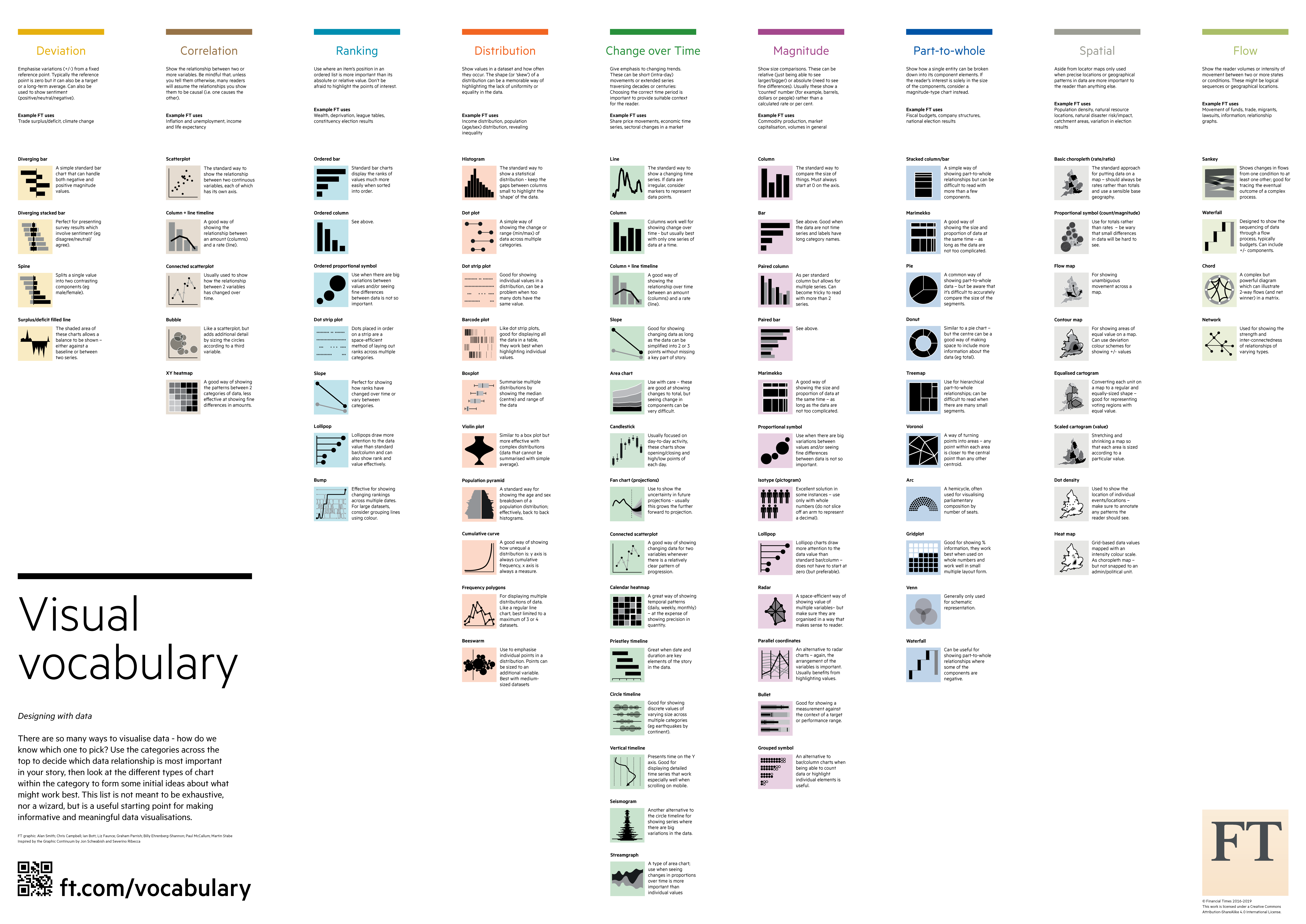
- Ranking: Ordered bar chart, slope chart, lollipop chart
- Change over time: Line chart, bar + line combination, slope chart
- Part-to-whole: Stacked bar, Tree map
- Deviation: Diverging bar chart, Spine Bar chart

Fig. shows some common personas in analytics.
Different personas, or types of users (Engineer, Executive etc.) use different views of data. So design your dashboards in a way that best answers the need of you target user. Leverage interactivity, markings, and filters as tools to expand your understanding of the data and visual.
Biases that Limit Data Literacy
Here bias refers to tendencies or circumstances that unduly and incorrectly favor drawing certain conclusions from the data. Not to be confused with opinion bias or bias in a machine learning model. Following are some biases that are a detriment to correctly understanding data:
- Confirmation Bias: Tendency to look for or confirm results corresponding to your preconceptions
- Selection or Sampling Bias: A sample data set that isn't random and contains some groups as being systematically over or under represented in the selection, thus biasing the sample. Ex: Online political polls over sample the demographic with easy access to internet (rich and educated).
- Funding Bias: Tendency of studies or experiments to support the interests of sponsors. May result from negative results not being published.
-
Anchoring Bias: Treating the first piece of information you receive as too important.
Data Literacy In Action
The fastest way to develop critical thinking and skills in Data Literacy is to question the data, the statistical analysis, and storytelling methods.
Questioning the Data
To understand your data better, try asking the following questions:
- How many rows and columns in the data?
- Do I have unstructured and/or text elements in my data?
- Is the data relevant and sufficient for the problem you're trying to solve?
- Where does the data come from? Could it be biased?
- Intuitively, what does a single row of data represent?
- Do I have a data dictionary?
- Do I know the data types, distributions, and units of data?
- Are there missing values, or inconsistent values? (Ex: pH > 14)
- Are there redundant, invariant, or highly correlated columns?
- How can I share or collaborate on this data?
This might help uncover many issues in your data that need attention. For example, if you suspect outliers in your data here's how you can detect and label them.

Fig. shows cheat Sheet on how to question data from Source.
Questioning the Visualization and Storytelling
To ensure the usefulness of your visualizations, ask the following questions:
-
What does the viz or dashboard show?
- Can I read it?
- How do things compare?
- Does it require cognitive load to understand?
- Is related information located proximally?
-
What does the viz or dashboard mean?
- Is data displayed meaningful or insignificant?
- Is it unusual or expected?
- Is it sufficient to form meaning?
- Are these insights accurate?
- Does it adequately display uncertainty?
-
What does it mean to me?
- What have I learnt?
- Do I know what actions to take?
- Can I use this?
These have been adapted from the webinar "Seeing Data" published on Visualizing data. Visual literacy as you can see, goes well beyond the basic aesthetics, but the aesthetics are important to interpret and act on the visualization. Here's a quick Dataviz best practices one pager cheat sheet for Spotfire aesthetics.
Questioning the Statistical Analytics
In the information age, more and more decisions either get automated by algorithms and machine learning, or supported by them. So it becomes crucial to understand, question, and evaluate the models. Here are some questions to start with:
- What are the assumptions behind this model?
- Does this model use features that can be understood and explained?
- Can this model explain its predictions?
- Features that the model considers important - do they make sense?
- Could there be human bias in this model?
- Does it use the right evaluation metric?
- How well does it perform on data it has never seen before?
-
How long before the model needs to be retrained?
Fostering Data Literacy Across the Enterprise

Like any new trend or technology, data literacy has an adoption curve as well. To encourage faster adoption across the enterprise, along with traditional methods such as rewards, improve the learning opportunities across your company. Ask yourself these simple questions to gauge if your workforce is equipped to move towards data literacy:
- Does your company culture encourage data driven decisions or opinion driven?
- Do your BI tools let the user explore, analyze, and dig deep into the data?
- Are the methods in your BI tools well documented or black-boxes?
- Do you have processes to teach readers domain specific methods and visualizations?
Learn how TIBCO can help make the most of your data through Augmenting Intelligence, Data Visualization, and Advanced Analytics.
Take the Data Literacy Quiz
Take the DIY Data Literacy quiz and see how you stack up:
Download this file from Resources below: diy_data_literacy_test.pdf
As a quick rule of thumb ask yourself the following questions after working with data, statistical analytics, or data visualization:
- Can you read and interpret it?
- Do you understand the goal or message?
- Does it uncover a valuable insight?
- Are you moved to act?
You should be able to answers yes to at least two of these questions before moving on to the task.
Citations
[1] (Whitepaper) Data-Pop Alliance
[2] (Wikipedia) Data Literacy
[3] (Wikipedia) Statistical Literacy
[4] (Wikipedia) Visual Literacy
[5] (Blog) Tufte's Principles for Visualizing Quantitative Information
[6] (Cheat sheet) Data Literacy Cheat sheet by Chart Mogul
[7] (Webinar) Seeing Data published on Visualizing Data
References
- (Glossary) Comprehensive Statistics Glossary
- (Wikipedia) bias in Statistics
- (Wiki) Top 10 ways for Outlier Detection in Spotfire
- (Wiki) Visual Design Best Practices for Spotfire
- (Git Blog) FT Chart Doctor choosing the right visualization
- (Cheat Sheets) Geckoboard Data Literacy Resources
- (Blog) How to be an Educated Consumer of Infographics by David Bryne
Recommended Comments
There are no comments to display.